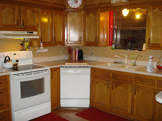
I currently have a red kitchen/dining area and I am now wanting a neutral area that bright and I can decorate with many different colors. I also have these awful wood cabnits that are all beat up and really need to be refinished....but we don't have the money for that at the moment so I was thinking about taking the doors off, sanding them down and painting them white myself. I know it would take some work but I would really like to give it a try. The hard part is going to be convincing my husband. I am also wanting to tear down the backsplash and replace it with something that doesn't look like it popped out of the 70's (it's yellow!!!).
Here is my kitchen. We need to replace the vent hood above the stove (it's that nasty yellow color too) but we are wanting to modify the cupboard above the stove so we can put a microwave up there. And I would love to put the lighting under the cabinets. Eventually we will get new countertops...but there is nothing wrong with mine so no hurry on that. I think that it would brighten up the whole kitchen and make it look bigger. Sorry I couldnt get the whole thing in...I have a L shaped kitchen with a breakfast bar on the right side which makes it a U shape. The fridge is over on the left side that is going to have to be replaced with a side by side. Right now it is just too small for all my cooking needs. And I want to get new bar stools for the breakfast bar. Mine are from the 80's! And I would love too replace the cupboards above the countertops so that they are more functional...we will see.


Here are a few that I found as inspiration...(I got all the pics from Cottage Living)
The only thing I liked about this picture was the color on the walls.

In this photo I love the fact that they used a dresser as a china hutch. I have been looking for a dresser to refinish and put in my kitchen. I can find one at an estate or garage sale a lot cheaper than I can buying one.

And in my last photo I love how it is so bright! That is what I want in my dining area (just on a much smaller scale). I would love to have that much space. I have two big windows that lets a ton of light in and when you have tons of sunshine you just feel happier.


Wow...I dont think that your kitchen looks bad at all. I had wood cabinets in our first house and then I had off white painted cabinets in our second house. I LOVE the look of white cabinets but they are so hard to keep clean. I love red too, my kitchen used to be red in our house in Alaska, I just like going with more neutral colors now because I can redecorate without having to paint the walls, and it also makes a space feel more open.
ReplyDeleteI love the striped chairs and all the light in the last one!
ReplyDeleteI hear you on the cabinets and man are they expensive to replace! I have pine colored ones too and would really like to paint them white. But they are in pretty good condition and fairly new so I'm holding off for now. You're right that neutrals would help with decorating. I have light green walls so fairly neutral but even so when I put out different table linens or holiday decor I think Martha would not approve, LOL!